150+ Ready Components Prototype Without CSS
Astrix ships 150+ accessible components you can import directly, letting designers prototype screens without writing custom CSS or tweaking themes.
meta/astryx
An open source design system that's fully customizable and agent ready
THE USEFUL PART
An open source design system that's fully customizable and agent ready
THE STACKRADAR WALKTHROUGH
A short introduction from our reel. See the project README for the current details.
Astrix ships 150+ accessible components you can import directly, letting designers prototype screens without writing custom CSS or tweaking themes.
Theme via CSS variables, brand apps with one file.
The CLI generates ready‐to‐ship templates and scaffolds components, enabling AI assistants and developers to create consistent UI pieces in seconds.
GITHUB SNAPSHOT
Recorded counts, not a growth rate or a quality score.
OBSERVED STAR HISTORY
Daily source snapshots are collected automatically. A trend appears after at least two real observations—no invented historical growth.

FROM THE PROJECT
Source excerpts from the project's README. Not an independent review, verification or security audit.
An open source design system that's fully customizable and built for how we build now: by people and the agents working alongside them.
Currently in Beta · Built on React 19+ and StyleX
[](https://www.npmjs.com/package/@astryxdesign/core) [](LICENSE) [](https://github.com/meta/astryx/wiki/Contributing)
[](https://astryx.atmeta.com) [](https://astryx.atmeta.com/storybook/) [](https://astryx.atmeta.com/sandbox/)
Docs · Storybook · Sandbox · Contributing · Discord
Astryx is an open source design system that grew inside Meta over the last eight years, where it became the most-used and largest design system in the company — powering 13,000+ apps and shaped by the engineers, designers, and product teams who depend on it every day.
It ships 150+ accessible components, brand-level theming, dark mode, ready-to-ship templates, and a CLI as one cohesive system. You import pre-built CSS and use typed React components — no build plugin, no styling library to adopt — and both people and AI assistants build with the same tooling.
What makes Astryx different:
Open internals. Components are built to be composed at any level, not locked behind a closed top-level API. The building blocks you'd reach for are exported directly, and when you need to go deeper, swizzle ejects a component's full source into your project to own.
No styling lock-in. Astryx authors its styles with StyleX, but that's invisible to consumers. Override with className using Tailwind, CSS modules, or plain CSS — whatever your project already uses.
Customize without wrapping. A theme is a set of CSS custom property overrides, so a designer can make Astryx unmistakably theirs without forking or wrapping component source.
Built for people and agents. The API, docs, and CLI are designed together so a person and an AI assistant build the same way, from the same reference.
Astryx requires React 19 or later (react and react-dom are peer dependencies of @astryxdesign/core).
Install Astryx, a theme, and its peer dependencies:
# npm
npm install @astryxdesign/core @astryxdesign/theme-neutral @stylexjs/stylex
npm install -D @astryxdesign/cli

# pnpm
pnpm add @astryxdesign/core @astryxdesign/theme-neutral @stylexjs/stylex
pnpm add -D @astryxdesign/cli

# yarn
yarn add @astryxdesign/core @astryxdesign/theme-neutral @stylexjs/stylex
yarn add -D @astryxdesign/cli
You can also install the CLI once for your computer, so astryx works in any folder and every coding agent knows Astryx; in a project, it still runs that project's own version:
npm i -g @astryxdesign/cliProject install, global install, or both? astryx docs global/project-global-or-both compares them (both is recommended), and astryx docs global explains how global mode works.
The simplest setup is a few CSS imports plus a theme provider — no build plugin, no PostCSS or Babel config. See the @astryxdesign/core README for the full guide (Next.js, Tailwind, Vite, and CDN).
For reliable CLI access, add a script to your package.json:
"scripts": {
  "astryx": "node node_modules/@astryxdesign/cli/clients/cli/bin/astryx.mjs"
}
Then use it as npm run astryx -- component --list. This avoids path errors when AI assistants or new developers invoke the CLI directly.
| Package | Description | README |
|---|---|---|
| @astryxdesign/core | Components, theme system, and utilities | README |
| @astryxdesign/cli | CLI tooling: component docs, templates, scaffolding, themes, and codemods | README |
| @astryxdesign/build | Build plugins for StyleX source builds | README |
| @astryxdesign/theme- | Seven ready-made, fully customizable themes (neutral, butter, chocolate, matcha, stone, gothic, y2k) | README |
@astryxdesign/lab (experimental components) is used internally for Storybook and the sandbox and is not published to npm. @astryxdesign/vega (Vega/Vega-Lite chart wrapper) and @astryxdesign/charts (chart components) are published to npm only under the @canary dist-tag — there is no stable release yet.
These are the promises Astryx makes to the people building on it.
Guidance over enforcement. Components give you capability rather than guardrails that fight you. Design opinions live in docs and examples — if you pass a value, the component renders it.
Strong, documented conventions. Every component follows the same naming, prop, and composition rules, and every one is thoroughly documented — so once you've learned a few, the rest feel familiar, and both people and AI can predict how an unfamiliar component behaves.
One system for humans and AI. The API, conventions, docs, and CLI are designed together so people and AI assistants build the same way. Every change that made Astryx easier for AI made it easier for people too.
Earned by measurement. We test conventions rather than assert them, hold the results loosely, and revisit them when a new situation proves them wrong.
The building blocks for visually cohesive and accessible interfaces: typography, color, layout, and accessibility.
A library of 150+ reusable UI building blocks with full TypeScript support.
Battle-tested design solutions for common interactions and workflows: table pages, detail page layouts, form wizards, navigation patterns, data entry flows.
| Directory | Purpose |
|---|---|
| apps/ | Example apps, the docsite, and Storybook |
| packages/ | Published packages: core, cli, build, themes |
| internal/ | Internal tooling: test utilities, eslint plugin, vibe tests |
We welcome contributions! See CONTRIBUTING.md for the full guide.
Questions, or want a hand with a PR? Come find us in Discord.
Our conventions and review rubrics live in the Contributing wiki — including API Conventions, Design Conventions, the Component Lifecycle, the Contributing Templates, and the Blog Review Rubric. Read the relevant rubric before opening a PR.
Quick start for contributors: this repo uses Node 22+ on an active LTS line and pnpm 11. Install pnpm directly, or enable Corepack once so the pinned pnpm version installs automatically:
corepack enable
pnpm install
If corepack is missing, install pnpm directly or install Corepack manually; see the troubleshooting notes in CONTRIBUTING.md.
The Theme Showcase DOM tests use the root ui project for shared DOM and StyleX test setup. Run pnpm exec vitest run --project ui apps/docsite/src/tests/theme-showcase/ from the repository root.
MIT
Read the original READMEKEEP EXPLORING
 Repository preview
strelov1/freehire
Open-source search engine aggregating 3.3M+ tech jobs directly from 294k+ company career pages. Zero recruiters, no reposts.
git clone https://github.com/strelov1/freehire.gitzenhostai/9drive
Virtual storage gateway pooling multiple free Google Drive accounts into a combined 60GB+ high-speed personal bucket.
git clone https://github.com/zenhostai/9drive.git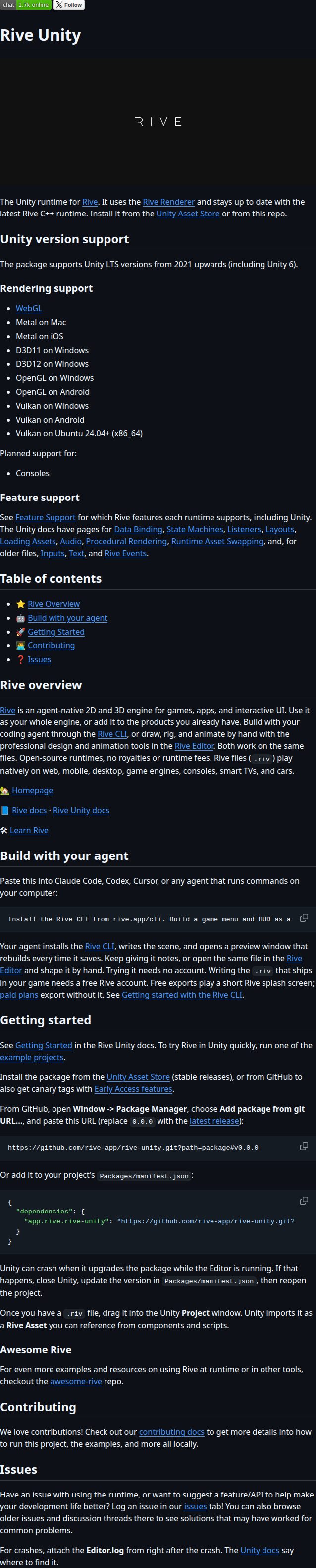 Repository screenshot
rive-app/rive-unity
Unity runtime for Rive, the agent-native 2D and 3D engine for games, apps, and interactive UI.
git clone https://github.com/rive-app/rive-unity.git
Short demos. New discoveries. Less noise in your feed.